On this pageWhat the device is
The short answer
Treat iPhone Duo as an iPhone that changes size. Build with Xcode 27.1 or later, lay out by size class instead of screen size or orientation, and use the standard containers (NavigationSplitView, TabView, .toolbar), which already handle the two displays, the side toolbars and the fold. For custom layouts, iOS 27.1 adds ArrangementView for two views that should part at the fold, reservedRegions(kind:) for keeping content out of the fold and away from the camera, and onHingeChange for effects driven by the hinge angle.
What iPhone Duo is
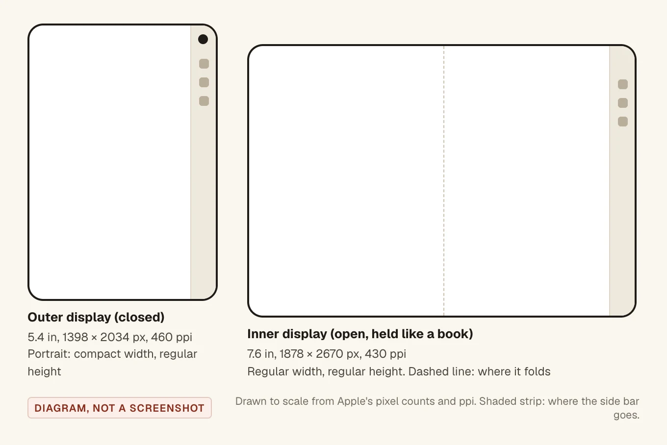
Apple announced iPhone Duo on 9 September 2026 as its first foldable iPhone, and said it would be available with iOS 27.1. It has two displays. The spec sheet lists a 5.4 inch outer display at 1398 × 2034 pixels (460 ppi) and a 7.6 inch inner folding display at 1878 × 2670 pixels (430 ppi). Both have ProMotion up to 120Hz and the Dynamic Island.
Closed, the phone is 84.1 mm wide and 117.8 mm tall. Open, it's 164.6 mm wide and the same height. So when it's open and held like a book, the inner display is wider than it is tall.
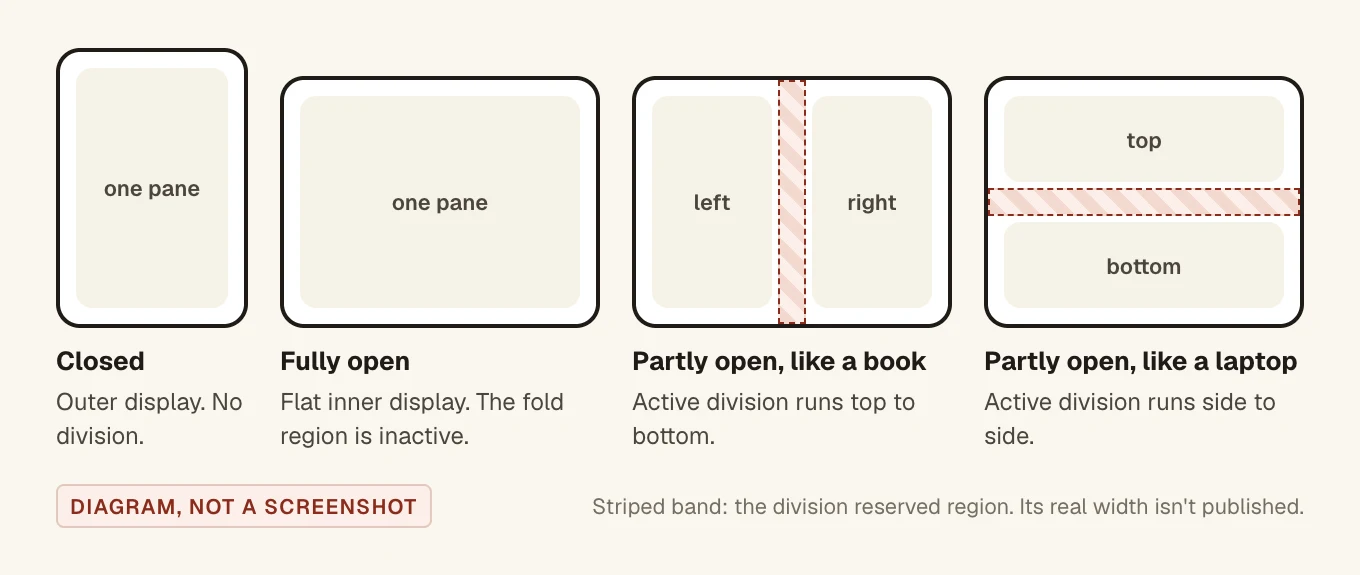
Apple's developer guide describes how the device moves between states: "As iPhone Duo is opened, closed, partially folded, and rotated, content transitions between displays and adjusts for rotated positions." The hinge reports three statuses: closed, partially open and fully open. The Human Interface Guidelines add the poses people use: partly folded like a book, set down on a surface, or standing on its edges.
Build with Xcode 27.1 or later
Start by rebuilding. The guide says that when you build with Xcode 26 or earlier, "your app doesn't extend under the status bar and camera". In the Prepare your app for iPhone Duo talk, Apple says an app built with an older SDK uses only the space to the left of the status bar and camera when the phone is closed, and gets "a familiar size and aspect ratio" when it's open. Building with the iOS 27.1 SDK gives you the whole screen.
To test, pick the iPhone Duo simulator. In Device Hub, buttons under the bezel close, partly open and fully open the device. Hold Option and drag the slider that appears to fold it to any angle.
Check your Mac before you plan a test day. When we went to test this on 12 November 2026, our Mac had Xcode 26.6, and its simulator list has no iPhone Duo. The download page says Xcode 27.1 and 27.2 both need macOS Tahoe 26.6 or later. We were on 26.5, so it was a macOS update and a restart first, then a 1.91 GB Xcode download. After that, every code sample in this post built with Xcode 27.2 and ran on the iPhone Duo simulator.
Lay out by size class, not by screen
Apple's advice is the same as for iPad: build one layout that resizes. From the talk:
| Where | Width | Height |
|---|---|---|
| Outer display, portrait | compact | regular |
| Outer display, landscape | compact | compact |
| Inner display | regular | regular |
Read them from the environment:
@Environment(\.horizontalSizeClass) private var horizontalSizeClass
@Environment(\.verticalSizeClass) private var verticalSizeClass
Drop these habits:
- Orientation checks. The talk says "the inner display doesn't honor your supported interface orientations". Your app scales on the inner display instead, including in Split View. Use size classes.
- Idiom checks. Don't decide layout from
userInterfaceIdiom. iPhone Duo is an iPhone with an iPad-sized screen inside. - The main screen. On a phone with two displays,
UIScreen.mainis ambiguous, and Apple says it will be deprecated. If you really need the screen, ask the window scene:window?.windowScene?.screen. Better still, size views from their container.
Apple hasn't published point sizes for either display. The talks and guide only give size classes, so don't hard-code a width you measured in the simulator.
Let the standard containers do the work
The HIG says that if you use standard components and support resizing, your app "automatically adapts to the device's poses with little adjustment required." In practice:
NavigationSplitViewcollapses to one column on the outer display and shows its columns on the inner one. With standard components, it also adjusts column widths and margins as the device folds.TabViewshows tabs on both displays. On the inner display you can ask for a sidebar.- Sheets, alerts and context menus move out of the fold on their own.
TabView {
    Tab("Notes", systemImage: "note.text") { NotesView() }
    Tab("Player", systemImage: "play.rectangle") { PlayerScreen() }
}
.tabViewStyle(.sidebarAdaptable)
.defaultTabBarPlacement(.sidebar)
A sheet is centred on the inner display. To keep the content behind it visible, put it on one side with presentationPlacement, new in iOS 27:
.sheet(isPresented: $showInfo) {
    InfoView()
        .presentationDetents([.medium, .large])
        .presentationPlacement(.trailing)
}
The HIG's rule for poses is "don't reinvent your app when it resizes". Mail shows a list or an email when closed and both side by side when open. Same features, one more level of hierarchy on the bigger screen.
Toolbars and tab bars move to the side
This is the biggest visual change. The outer display is wider and shorter than other iPhones, so the system moves the toolbar, tab bar, navigation buttons, status bar and Dynamic Island into one vertical strip on the side. The strip stays on the side when the device opens in landscape. Only the inner display in portrait keeps normal top and bottom bars.
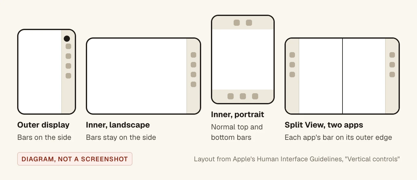
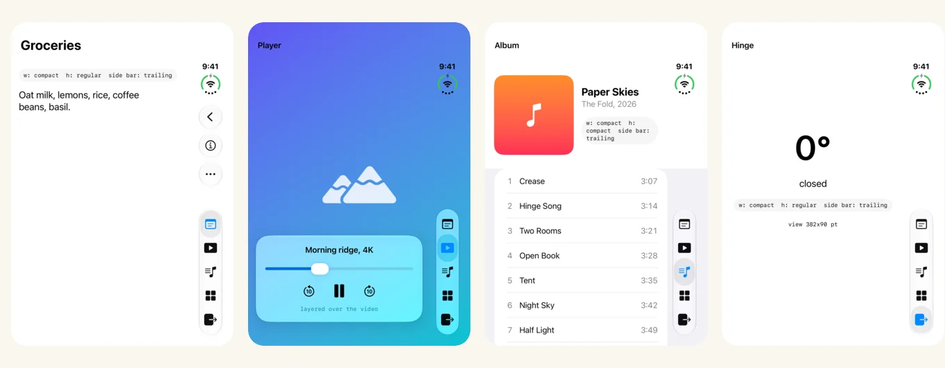
toolbarVerticalEdge reads trailing.You get this for free if your bars come from a container. In SwiftUI, put your items in .toolbar inside a NavigationStack or NavigationSplitView. A hand-made bar view won't move. The guide and the Raise the bar with iPhone Duo talk add these rules for the items:
- Give every item a title and a symbol. A vertical bar shows only symbols, and an item with a title but no symbol can't go in a vertical bar at all.
- Put Back or Close at the top (
.cancellationAction) and the main action just under it (.topBarPinnedTrailing). - Items overflow from the bottom up. Use
visibilityPriorityto keep the important ones. - Use the system overflow menu (
ToolbarOverflowMenu) instead of your own "..." button.
.toolbar {
    // Main action: pinned near the top of a vertical bar.
    ToolbarItem(placement: .topBarPinnedTrailing) {
        Button("Info", systemImage: "info.circle") { showInfo = true }
    }
    // Title and symbol on every item, so it can go anywhere.
    ToolbarItemGroup(placement: .bottomBar) {
        Button("Share", systemImage: "square.and.arrow.up") { }
        Button("Pin", systemImage: "pin") { }
        Button("Delete", systemImage: "trash") { }
    }
    // Always in the overflow menu.
    ToolbarOverflowMenu {
        Button("Duplicate", systemImage: "plus.square.on.square") { }
        Button("Move", systemImage: "folder") { }
    }
}
If a custom view has to sit opposite the bar, read which edge the system uses with toolbarVerticalEdge. It's nil where there's never a vertical bar:
@Environment(\.toolbarVerticalEdge) private var toolbarVerticalEdge

var body: some View {
    FloatingToolPalette()
        .frame(maxWidth: .infinity,
               alignment: toolbarVerticalEdge == .trailing ? .trailing : .leading)
}
Two more controls exist for edge cases. .toolbarVerticalBehavior(.disabled) puts bars back at the top and bottom, and Apple limits it to things like a full-screen video player or a calculator. .toolbarVerticalCompressionBehavior(.prefersToolbarItems) keeps toolbar items ahead of the tab bar when space runs out, for task-focused screens. The HIG says "in general, don't override the default bar placement." We agree. If you only fix one thing this week, give every toolbar item a symbol and a title, because that's what decides whether it shows up in the side bar at all.
Two views that part at the fold: ArrangementView
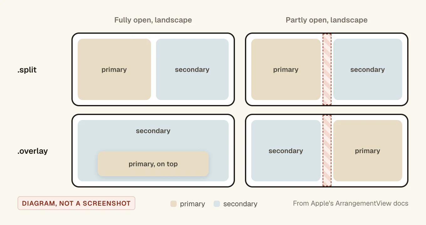
ArrangementView is new in iOS 27.1. It holds a primary and a secondary view and places them by size class, orientation and the fold. It has two styles.
Split: side by side, or one above the other
The primary view goes leading in landscape and on top in portrait, and the arrangement keeps both clear of the fold. It replaces the if that switches between HStack and VStack. The two views get equal space by default; splitArrangementLayoutRatio changes that. On a closed iPhone Duo in landscape, a split shows only the primary view.
ArrangementView {
    AlbumArt()
        .splitArrangementLayoutRatio(0.4)
} secondary: {
    TrackList()
}
.arrangementViewStyle(.split)
Inside, a view can read splitArrangementAxis to lay itself out the other way:
struct AlbumArt: View {
    @Environment(\.splitArrangementAxis) private var axis

    var body: some View {
        let layout = axis == .horizontal
            ? AnyLayout(VStackLayout())
            : AnyLayout(HStackLayout())
        layout {
            Artwork()
            Metadata()
        }
    }
}
Overlay: layered when flat, apart when folded
On a flat display the primary view sits on top of the secondary, like controls over a video. When the device is partly open, the views move to separate sides: secondary leading and primary trailing in landscape, secondary on top and primary below in portrait. overlayArrangementEdge changes the side.
ArrangementView {
    PlayerControls()
} secondary: {
    VideoArea()
}
.arrangementViewStyle(.overlay)
The Strike a pose with adaptive layouts talk shows a view checking overlayArrangementZIndex to tell whether it's layered over the other view or beside it, so it can collapse or expand. Here's the idea in short:
struct PlayerControls: View {
    @Environment(\.overlayArrangementZIndex) private var zIndex

    var body: some View {
        ControlsPanel(compact: zIndex > 0) // layered over the video
    }
}
Limit either style to one axis with .split.axes(.horizontal) or .overlay.axes(.vertical). On axes you leave out, only the primary view shows. Keep navigation outside: put the arrangement inside a NavigationStack, never a NavigationSplitView or TabView inside the arrangement. Don't put one inside a List or ScrollView either.
Which one would we pick? Split, most of the time. It's the right fit for any screen that's already two panes. Overlay only makes sense when one view really is a layer on the other, like controls on a video or a map.
Keep custom views out of the fold
Most apps never need this, because the system containers already keep clear of the fold and the cameras. Apple's docs point out one big exception: lists, tables and scroll views don't split their content at the fold, so a row can run across it. Floating controls and anything you place with explicit frames need care too.
iOS describes these areas as reserved regions. There are two kinds:
.division: the fold. It's active only when the device is partly open. Fully open, it's inactive and you get no division back..occlusion: something covering the screen. The outer front camera always occludes. The inner camera is hidden behind the display and only occludes while it's in use.
Read them from a GeometryReader. Frames are in the view's own points, and already include a margin. This grid, adapted from Apple's example, splits into two panes with an empty gap where the fold is:
GeometryReader { proxy in
    if let division = proxy.reservedRegions(kind: .division).first {
        let frame = division.frame
        if frame.height > frame.width {
            // Folded like a book: the fold runs top to bottom.
            HStack(spacing: 0) {
                Tiles().frame(width: frame.minX)
                Color.clear.frame(width: frame.width)
                Tiles().frame(width: proxy.size.width - frame.maxX)
            }
        } else {
            // Folded like a laptop: the fold runs side to side.
            VStack(spacing: 0) {
                Tiles().frame(height: frame.minY)
                Color.clear.frame(height: frame.height)
                Tiles().frame(height: proxy.size.height - frame.maxY)
            }
        }
    } else {
        Tiles()
    }
}
A few more things from the docs:
- Pass
options: .includeInactiveto get regions that aren't active yet, then checkisActive. Leaving room early stops the layout jumping when someone starts folding or turns on the inner camera. - iOS mirrors the frames for right-to-left languages by default. Pass
layoutDirectionBehavior: .fixedif your positions don't flip. - Use an even number of grid columns, and move as little as you can. The HIG says to favour "small adjustments over rearrangement".
Read the hinge for effects, not layout
onHingeChange gives you the old and new hinge context. Its hinge is a DeviceHinge with an angle and a status (.closed, .partiallyOpen, .fullyOpen), or nil on a device without a hinge.
@State private var hinge: DeviceHinge? = nil

var body: some View {
    VStack {
        if let hinge {
            Text("\(Int(hinge.angle.degrees))°")
        } else {
            ContentUnavailableView("Hinge Unavailable",
                                   systemImage: "rectangle.split.2x1")
        }
    }
    .onHingeChange { _, newContext in
        hinge = newContext.hinge
    }
}
In the multiple displays talk, Apple uses the angle to bend a guitar note. It also says hinge data "is ideal for driving interactions or effects. For layout, use the arrangement and region APIs." Apple hasn't published the angle range or the angles where the status changes, so don't hard-code thresholds.
Multiple windows and the camera
Per the multiple displays talk, iPhone Duo is the first iPhone that can show more than one window of your app, but only on the inner display. On the outer display, new windows can't be created. Every app takes part in Split View on the inner display, with two apps side by side, so your app has to work at half width too. In UIKit, a UIWindowSceneActivationAction hides itself when a new window isn't possible.
Camera apps have two more things to handle. When someone opens, closes or turns the phone, your app can move to the other display and the camera you're using can end up facing the other way. And when the phone is open and recording with the rear camera, a camera capture accessory can show content on the outer display. In SwiftUI that's a CameraCaptureAccessory inside .sceneAccessory. The system decides when the accessory is available, so keep the app working without it.
What Apple hasn't published
We only used Apple's own pages for this guide. As of 12 November 2026, these weren't in any of them:
- Point sizes for the outer or inner display, or for each half in Split View.
- The width of the fold's reserved region.
- The hinge angle range, and the angles where the status changes.
- What happens to an open second window, or a Split View pair, when someone closes the phone.
One thing doesn't add up. The press release says both displays share the same aspect ratio. Going by the spec sheet's pixel counts, the outer display is about 1.45 to 1 and the inner about 1.42 to 1. Close, not equal. Design to size classes and it won't matter.
A test pass before you ship
- Build with Xcode 27.1 or later and run on the iPhone Duo simulator.
- Open every screen closed, fully open and partly open. Rotate in each.
- Look at every sheet, popover and menu as you fold and unfold.
- Check the side bars: are the right items still visible, and is everything else in the overflow menu?
- Look for anything sitting in the fold, like list rows, floating buttons and custom grids.
- Put your app in Split View on the inner display, on both sides.
- Try a right-to-left language if you use reserved regions.
- Check that state carries over when you open or close the phone mid-task.
Shipping soon? Our App Store submission checklist covers the rest.
Questions people ask
Do I need to rewrite my app for iPhone Duo?
No. Apple says an app built from standard components that supports resizing adapts with little work. Rebuild with Xcode 27.1 or later, test each pose, and fix what lands in the fold or the side bars.
What size classes does iPhone Duo use?
The outer display behaves like other iPhones: compact width and regular height in portrait, compact both ways in landscape. The inner display is regular in both directions.
Why are my toolbar buttons on the side of the screen?
On the outer display, and on the inner display in landscape, the system moves toolbars and tab bars into a vertical strip on the side. Use .toolbar with a navigation container and give each item a title and a symbol.
Can I turn off the vertical toolbar?
Yes, with .toolbarVerticalBehavior(.disabled). Apple suggests it only for screens like a full-screen video player or a calculator, and recommends keeping the default everywhere else.
Which iOS version added the iPhone Duo APIs?
ArrangementView, ReservedRegion, onHingeChange and toolbarVerticalEdge are marked iOS 27.1 in Apple's documentation.
What are the iPhone Duo screen sizes in points?
Apple hasn't published them. The spec sheet gives pixels: 1398 × 2034 for the outer display and 1878 × 2670 for the inner one. Lay out by size class instead.